Overview
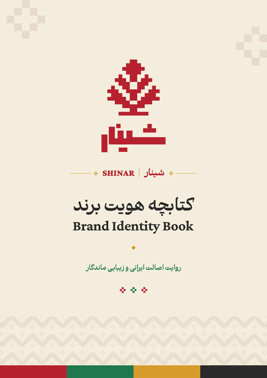
Shinar is an Iranian handicraft brand and cultural platform created to connect Iranian art, artists, and craftsmanship with contemporary and international audiences. The client selected the name; I shaped the visual identity and supported parts of the strategy, verbal direction, and copy.
- Visual Identity Design
- Brand Strategy Support
- Bilingual Brand Guidelines
- Digital Direction
- Brand Applications
The brief
The identity needed to feel culturally grounded without becoming nostalgic or ornamental. It also had to work bilingually across digital platforms, product storytelling, packaging, stationery, and future retail touchpoints before the brand's public launch.
The idea
The system brings together the pomegranate, leaf structures, pixel-based forms, Iranian craft, roots, continuity, generosity, and the plane tree as a cultural metaphor. A restrained cream field lets the red, green, saffron, and charcoal palette carry both warmth and clarity.
My role
I independently designed the visual identity, logo system, patterns, bilingual guidelines, digital direction, and applications. I contributed to selected strategic and verbal decisions; the identity is delivered, while the brand remains pre-launch.
Ch. 01Brand core
A bridge from the artist’s hands to today’s homes.
Shinar was born to keep the spirit of Iranian art alive — a bridge from the hands of artists to the eyes of today’s audiences, from the authenticity of the past to the world we live in now.
- Authentic
- Calm
- Caring
- Inspiring
Purpose and personality, from the Shinar brand book.
- 01Authenticity
Rooted in Iran’s history and culture; loyal to the story of every piece.
- 02Beauty & finesse
Every detail reflects an Iranian eye for beauty.
- 03Honesty & respect
For the artist, the customer and the national heritage.
- 04Innovation for tradition
Old crafts retold in today’s language, identity intact.
- 05Care for land & heritage
Respect for nature; heritage kept for the next generations.
- 06Growth & generosity
Steady, fruitful growth — like the plane tree, generous with its shade.
Ch. 02The mark
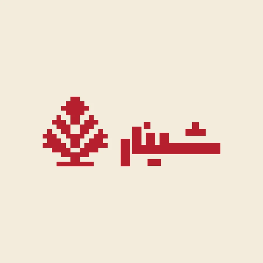
A pomegranate tree, drawn one pixel at a time.
The pomegranate, its leaves and the plane tree, built from square cells — the way a carpet is knotted or a tile wall is set, one unit at a time. Pick a plate, or switch on the grid to see how it is built.
Ch. 03Colour
Pomegranate, leaf, saffron — on sandstone.
A restrained cream field lets the red carry warmth and the green carry life; saffron bronze is kept for the precious details. Click a colour to copy it.
Ch. 04Type
Two scripts, one voice.
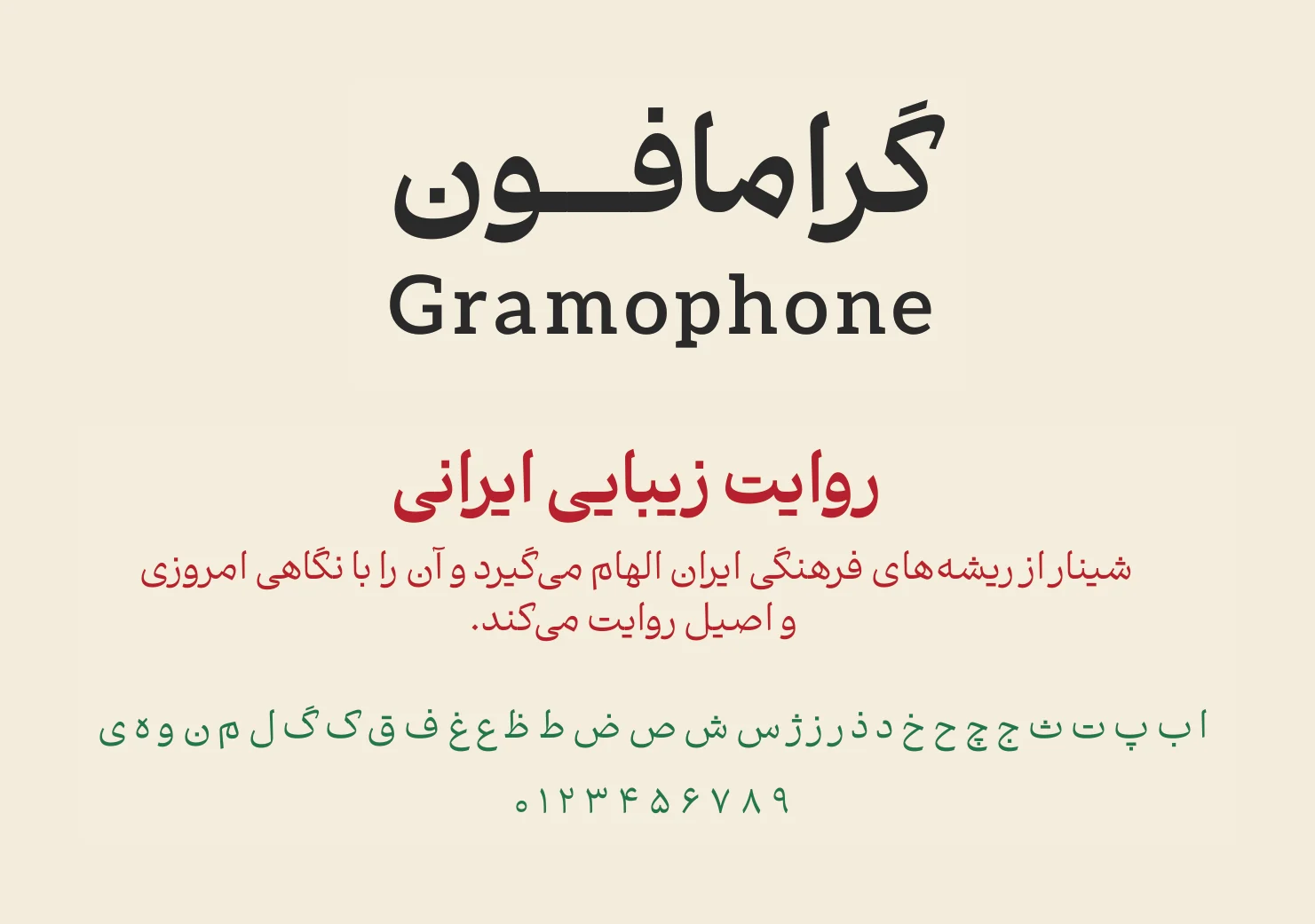
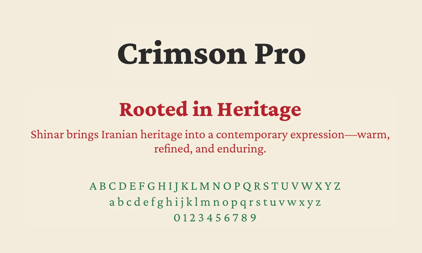
The voice is warm, sincere and never loud: it tells stories rather than slogans, and speaks with “we” and “you” — not “customer” and “product”.
Ch. 05Pattern
The mark becomes a surface.
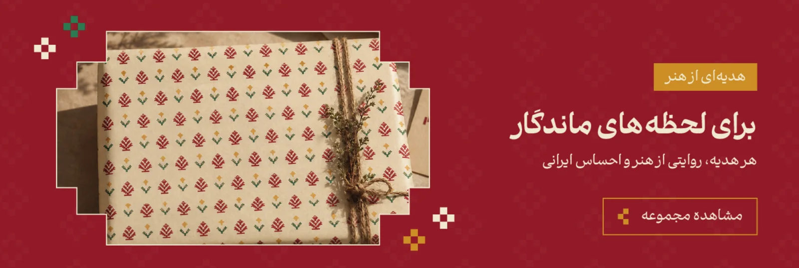
The patterns are built from the same cells as the mark, so they can cover a gift box or sit quietly behind a letterhead. Rebuilt here as live vectors — change the scale.
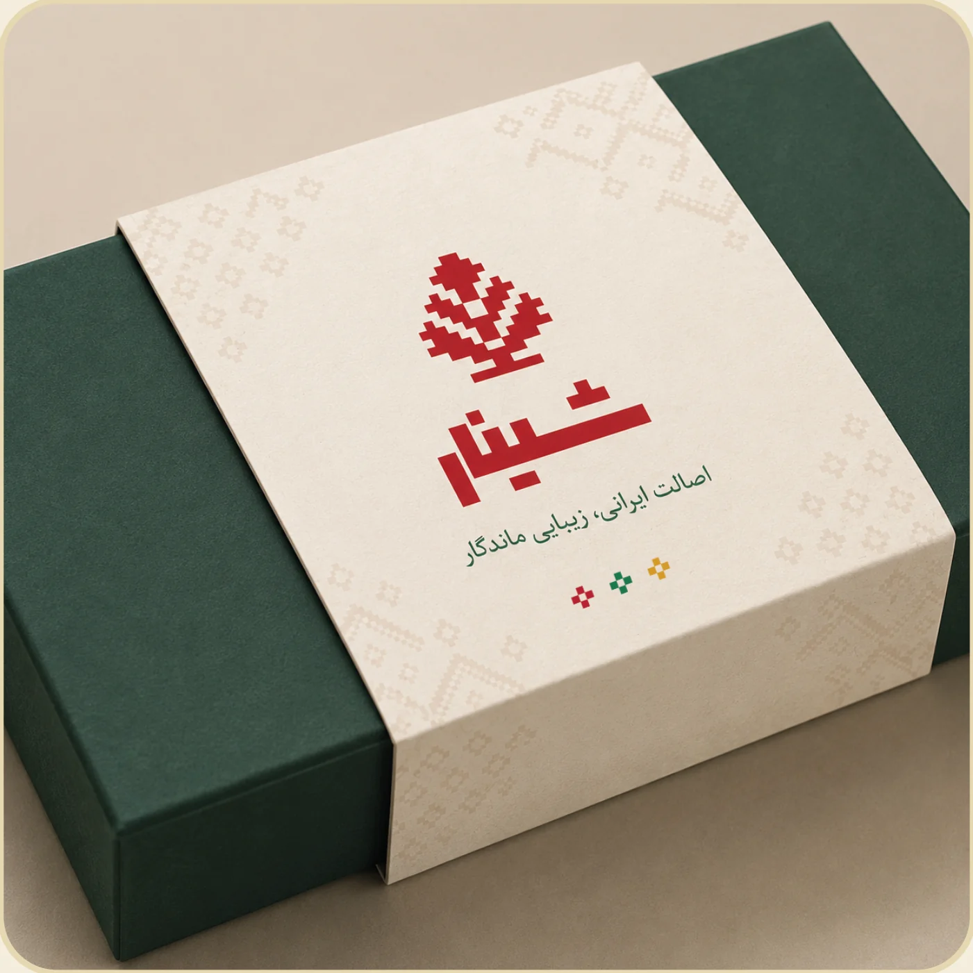
Packaging, gift wrap, shopping bags, campaign pages.
Ch. 06Packaging & signage
From the workshop to the shelf.
Three rules travel with every application: protect the mark’s clear space, one dominant pattern per surface, approved colours only.
Ch. 07Stationery
The same care, on paper.
Letterhead, envelope and business card, laid out as printed. Turn the card over.
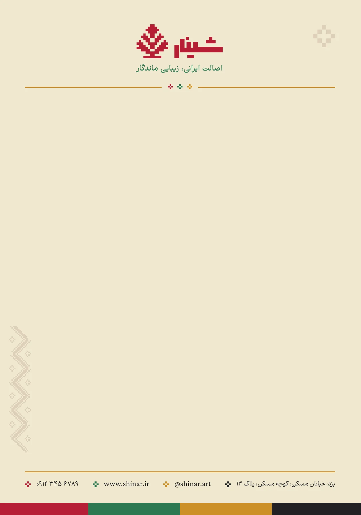
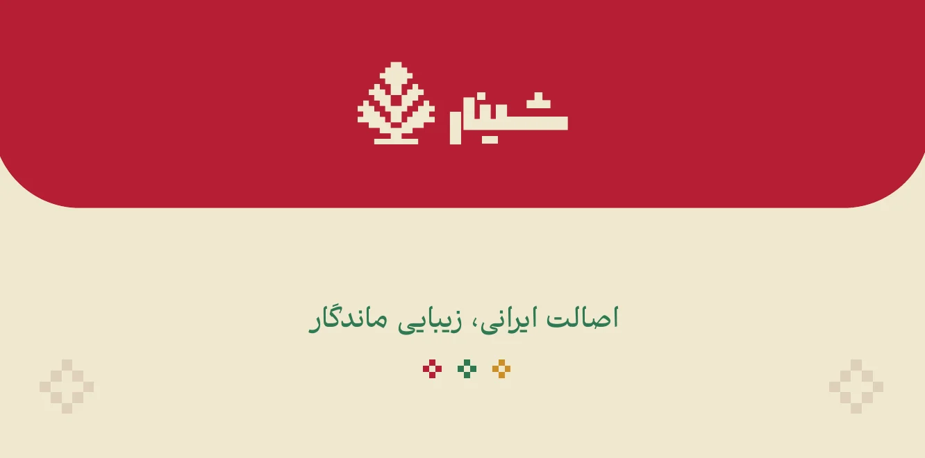
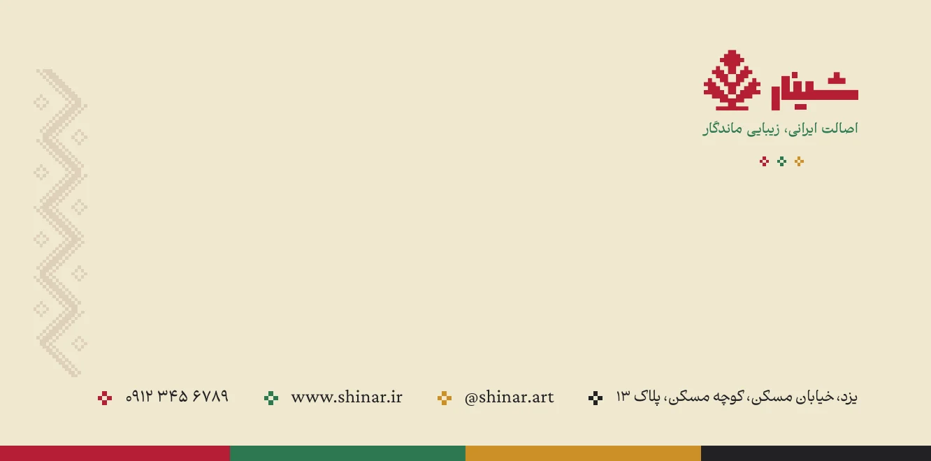
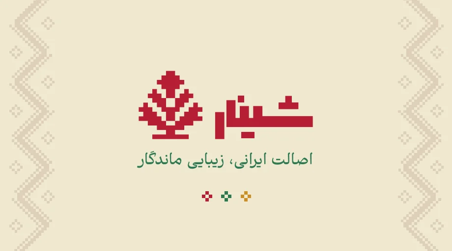
The front carries only the mark and the tagline; the back sets the contact details beside it, each line led by a pixel motif in one of the four brand colours.
Ch. 08Digital
Frames borrowed from Iranian architecture.
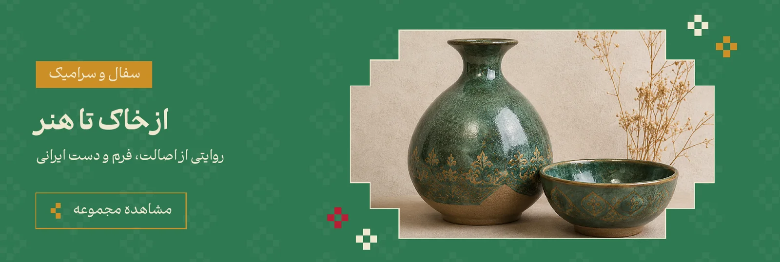
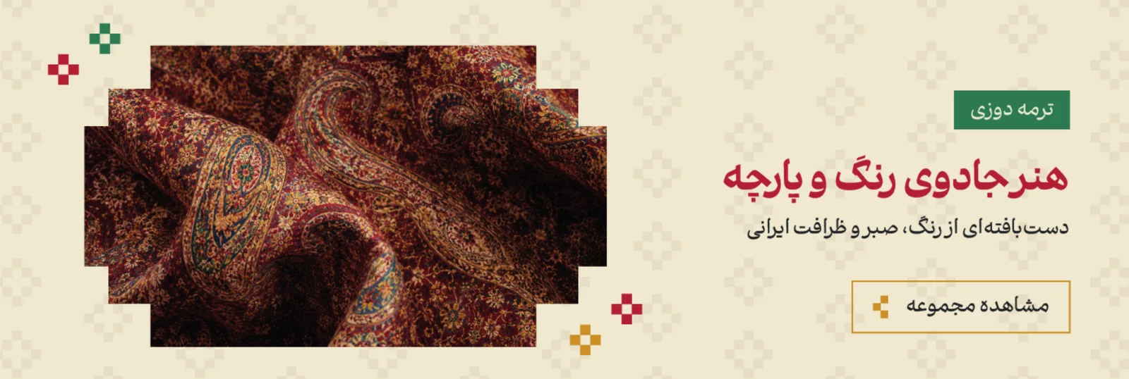
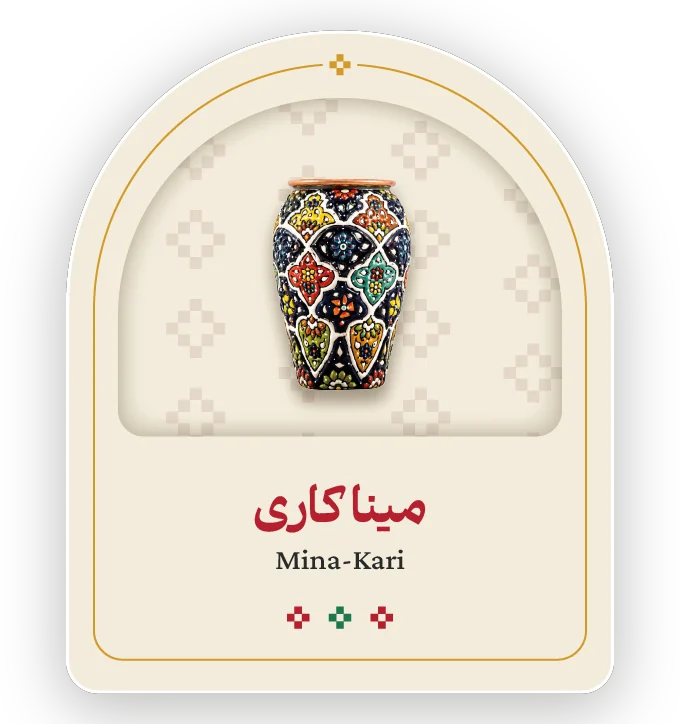
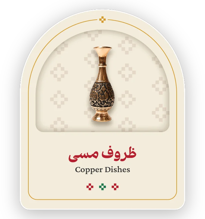
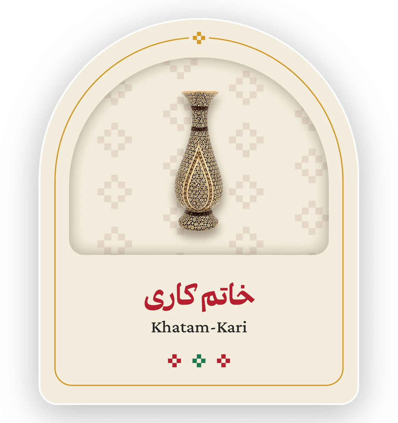
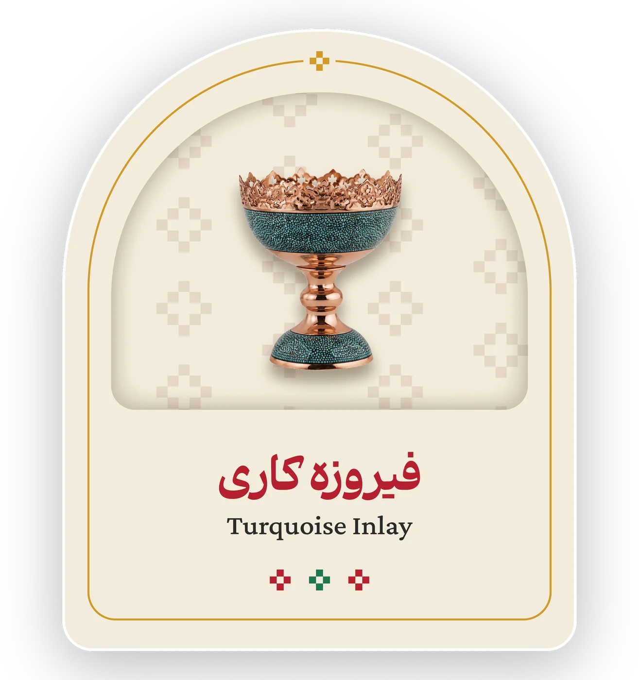
On the website each craft stands in an arch, so the artwork stays the centre of attention; hero banners carry the pattern and the palette.
Credits & status
Clear about the work.
- Client-selected brand name
- Visual identity and supplied executions: Danial Hadizadeh