Overview
Rabona is a game club built around playing together. Its visual identity balances the ease of a friendly get-together with the excitement of the game, and its first big moment is the Rabona Cup, an FC 27 tournament.
- Visual Identity
- Brand Presentation
- Character Design
- Iconography
- Instagram Launch Grid
- Highlight Stories
- Tournament Campaign
The brief
The club needed an identity that felt friendly rather than aggressive, worked in Persian first, and could carry both everyday information — hours, contact, route — and a tournament campaign.
The idea
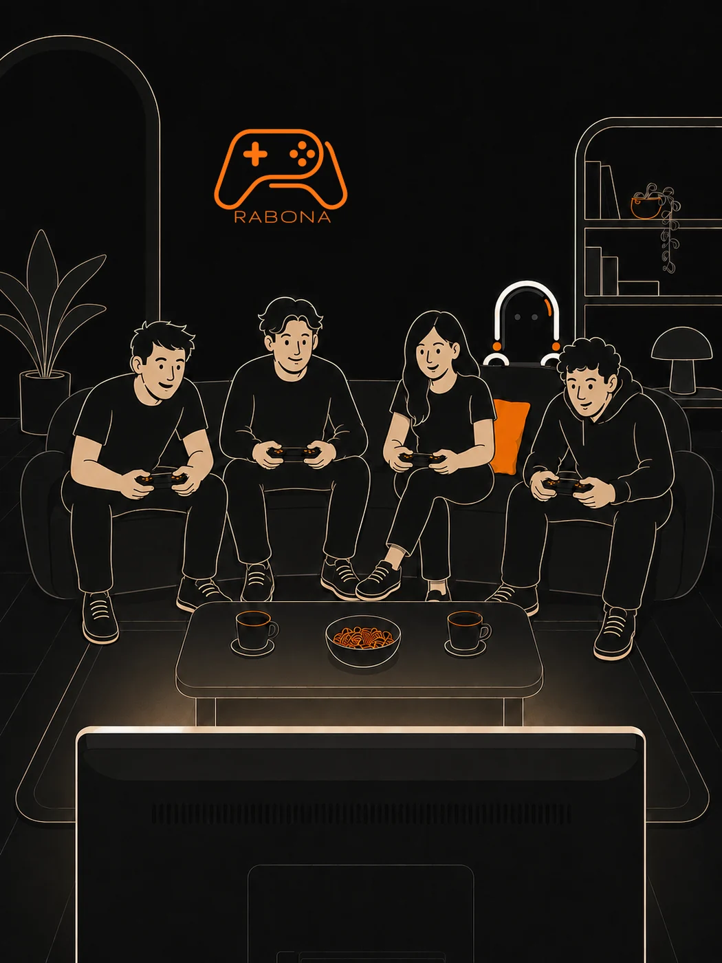
Bold orange on warm black and cream, soft rounded forms, and one graphic device — a single rounded line ending in an orange dot, taken from the controller mark. A capsule-bodied character with no mouth expresses everything through posture.
My role
I designed the visual identity system and brand presentation, the character and its poses, the icon and highlight-cover set, the nine-post launch illustration, the highlight stories, and the Rabona Cup and student campaigns. The existing logo was rebuilt as clean vectors.
Ch. 01Brand personality
Playing, together.
Rabona brings the feel of a friendly get-together to the excitement of the game. The identity rests on the same balance: bold colour, soft forms, and restrained detail.
- Intimacy
- Excitement
- Simplicity
From the Rabona brand presentation.
Ch. 02The mark
A controller drawn in one line.
The mark is a game controller traced as a single rounded contour, set above a light, wide wordmark. It is drawn on here the way it is built — line first, then the buttons.
Ch. 03Colour & type
Distinct colours, readable type.
Cream for clarity, black for depth, orange for emphasis. Gruppo sets the wide Latin wordmark; Dana carries all Persian text. Click a colour to copy it.
Ch. 04Line & dot
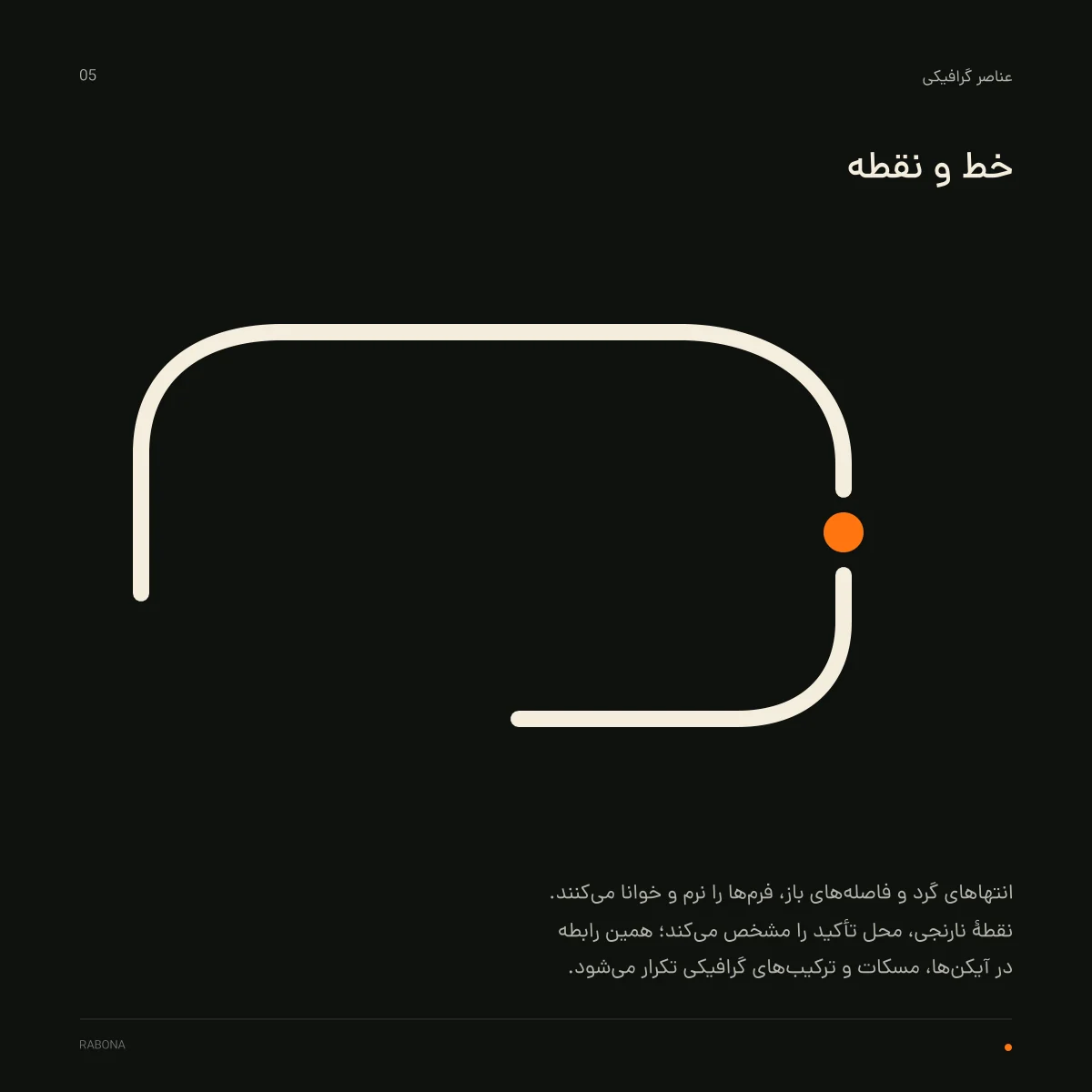
One stroke, one orange dot.
The controller’s rounded contour leaves the logo and becomes the system’s graphic device: frames, routes and dividers, always ending in a single orange dot.
- About
- Hours
- Contact
- Location
- Tournaments
Ch. 05Character
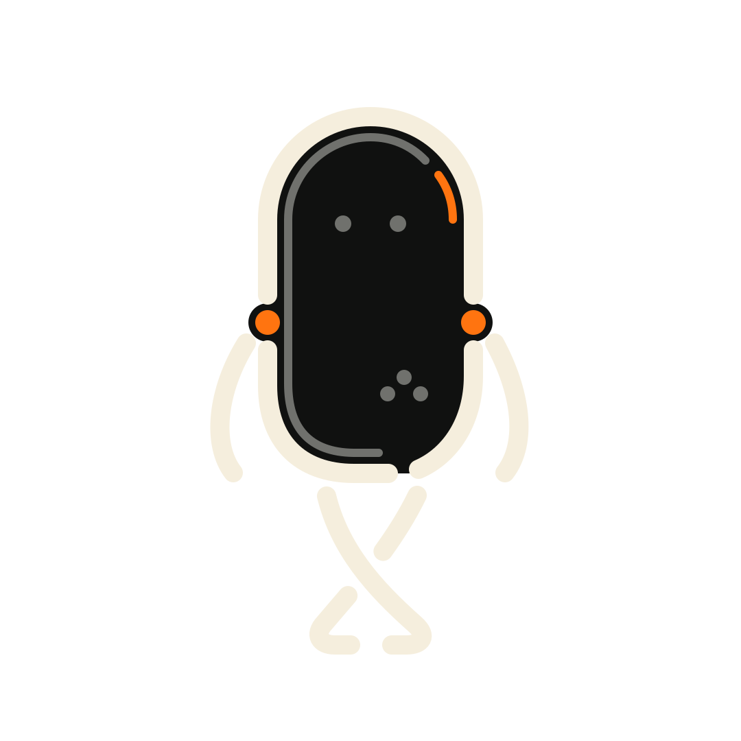
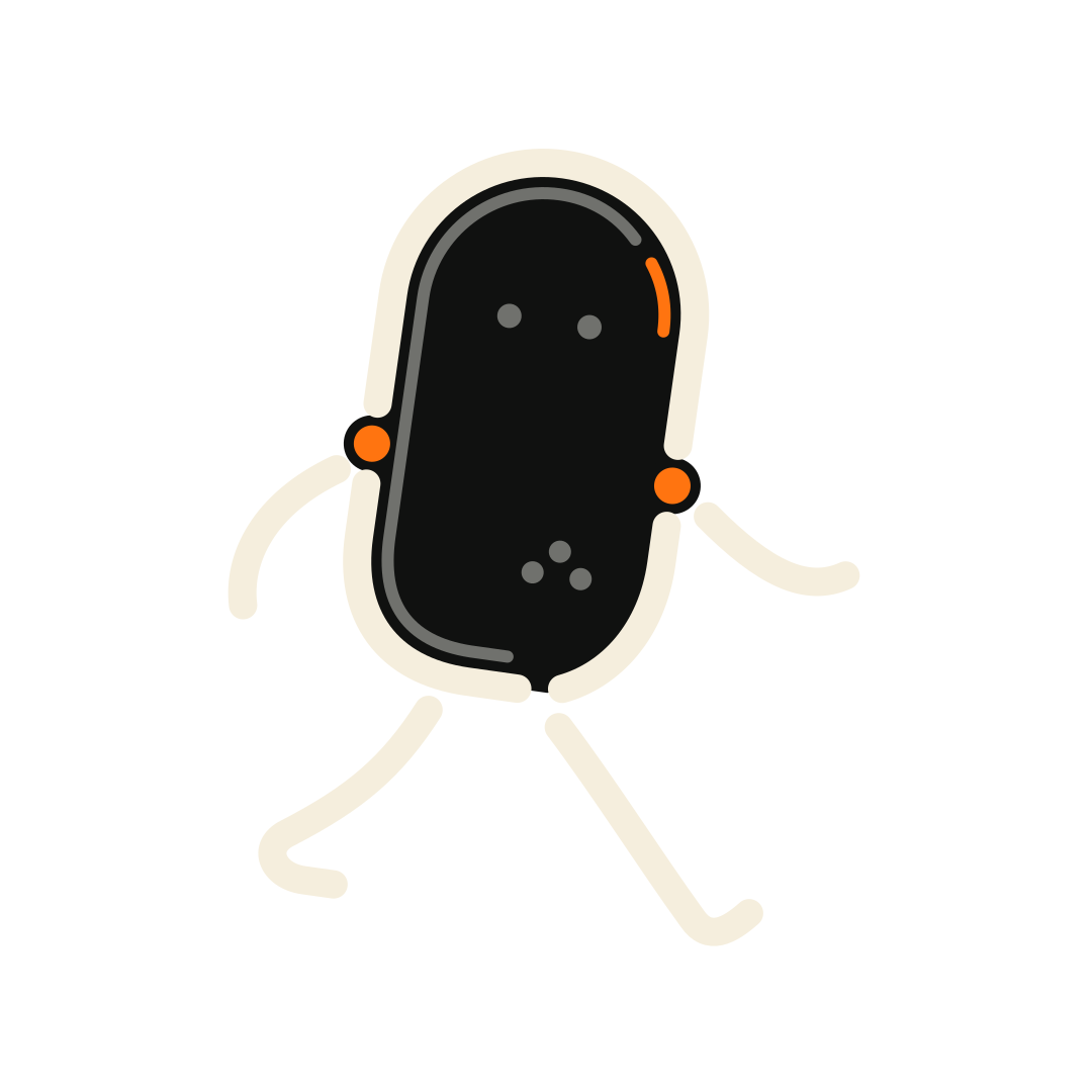
A player from the world of the game.
A rounded capsule body, orange shoulder joints and no mouth: personality comes from posture alone.
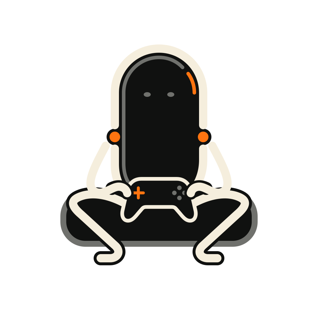
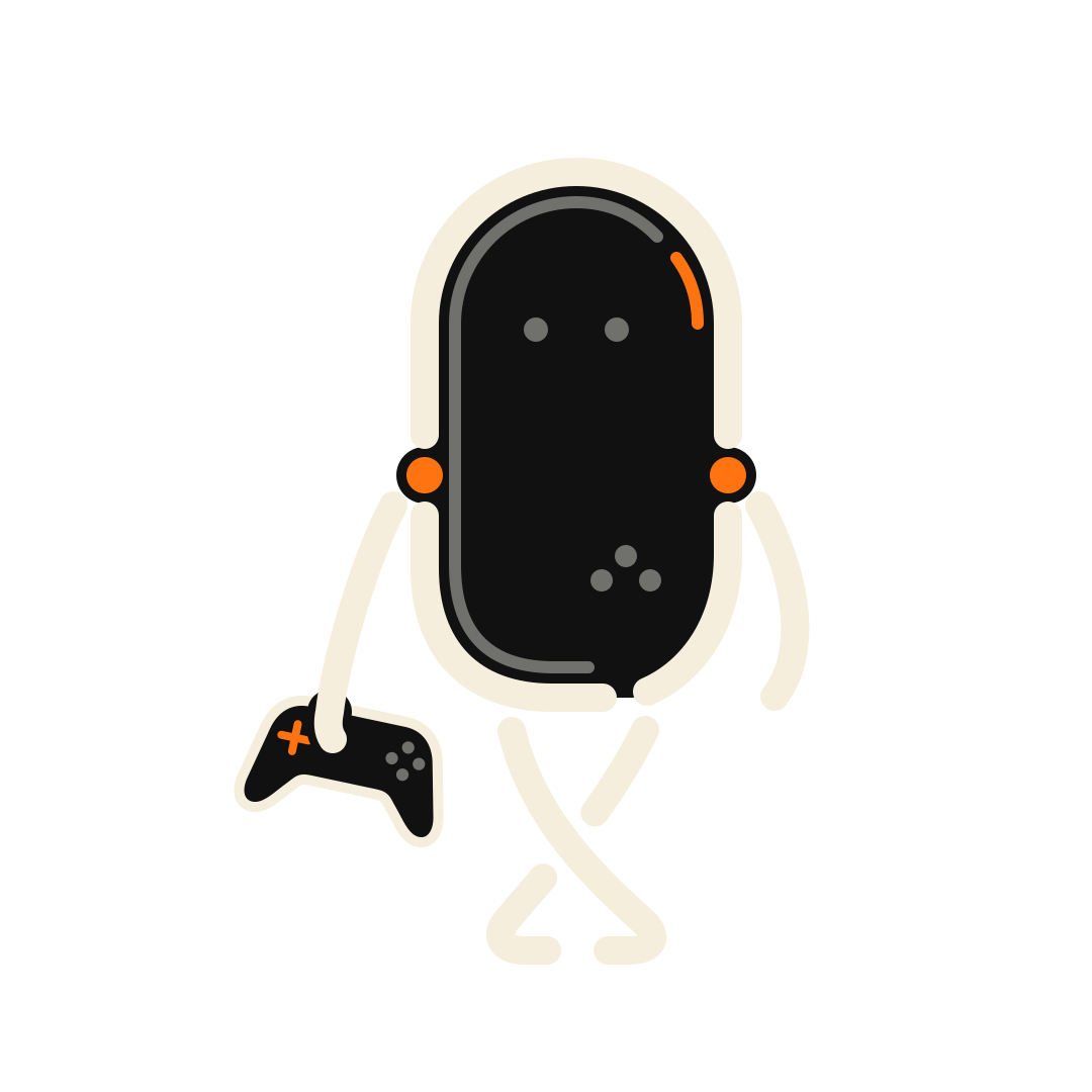
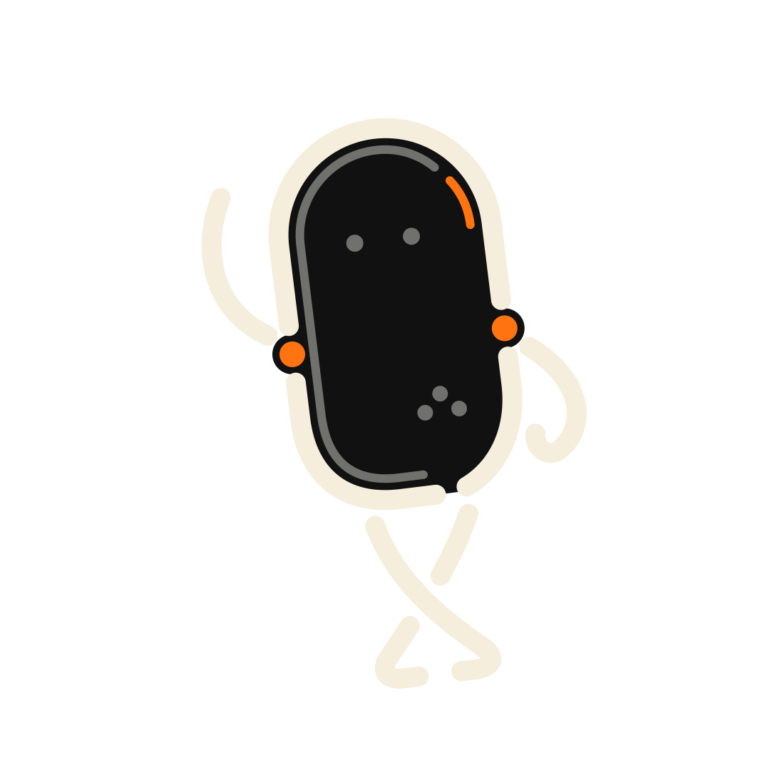
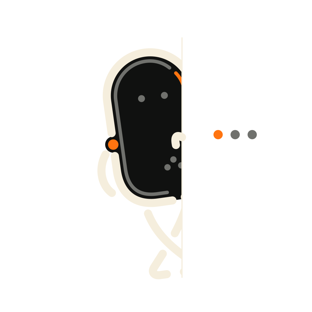
Sitting back, waiting for the next match.
Ch. 06Launch grid
One scene, cut into nine frames.
The launch is a single illustration of friends at the club, split across nine posts. Scroll to publish it: post 1 goes up first, bottom-right, and the picture only completes with post 9.
 9posts—followers—following
 About
About Hours
Hours Contact
 Location
 Tournaments
- 01
- 02
- 03
- 04
- 05
- 06
- 07
- 08
- 09
Ch. 07Highlights
Time, contact and route — in five stories.
Tap the sides of the phone to move through a highlight, or pick a cover. Hover to pause.
rabona.clubAbout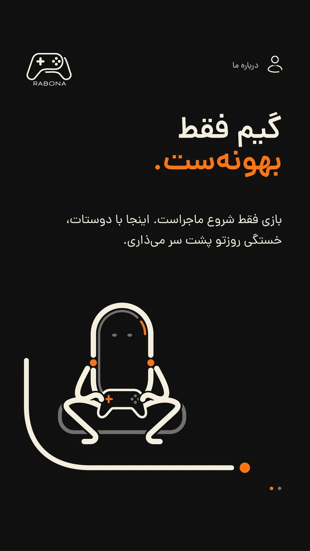
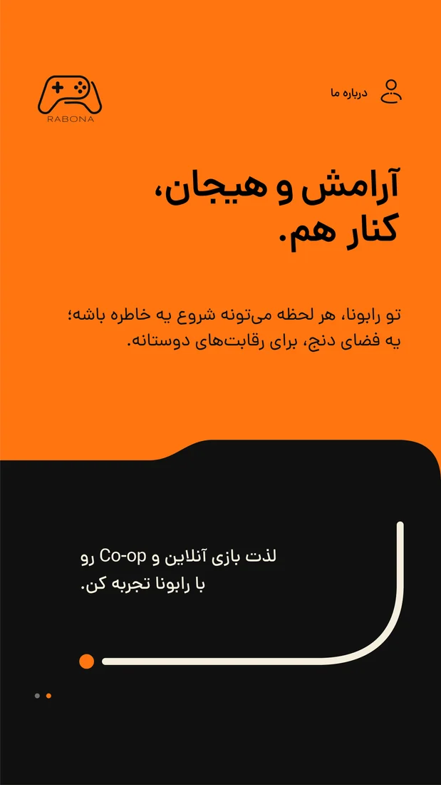
Ch. 08Rabona Cup
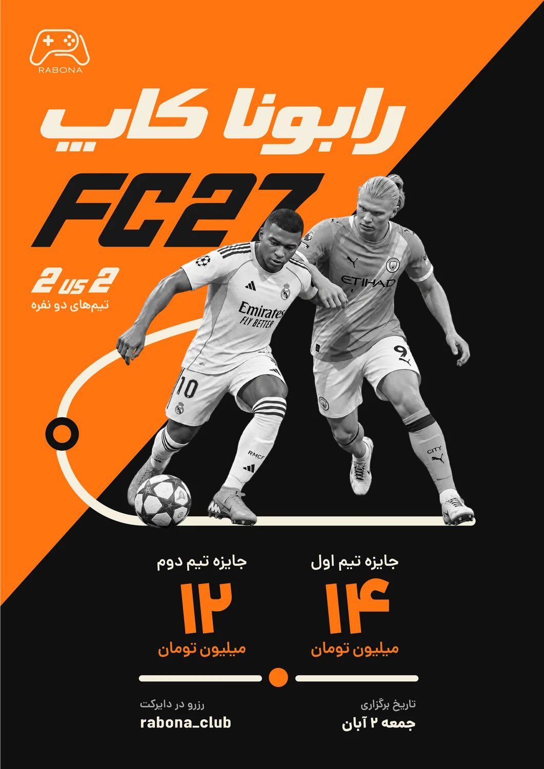
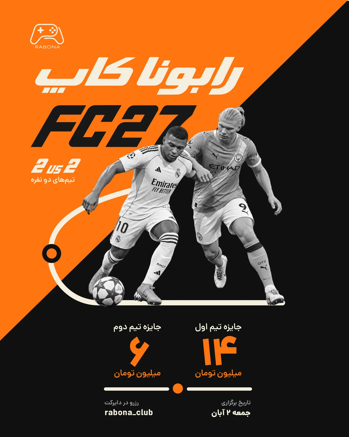
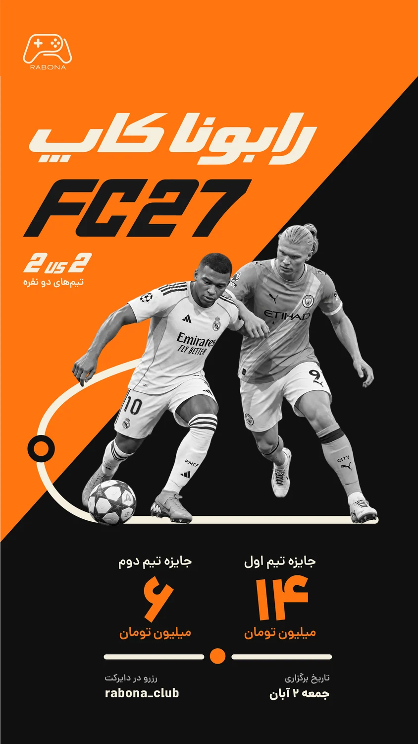
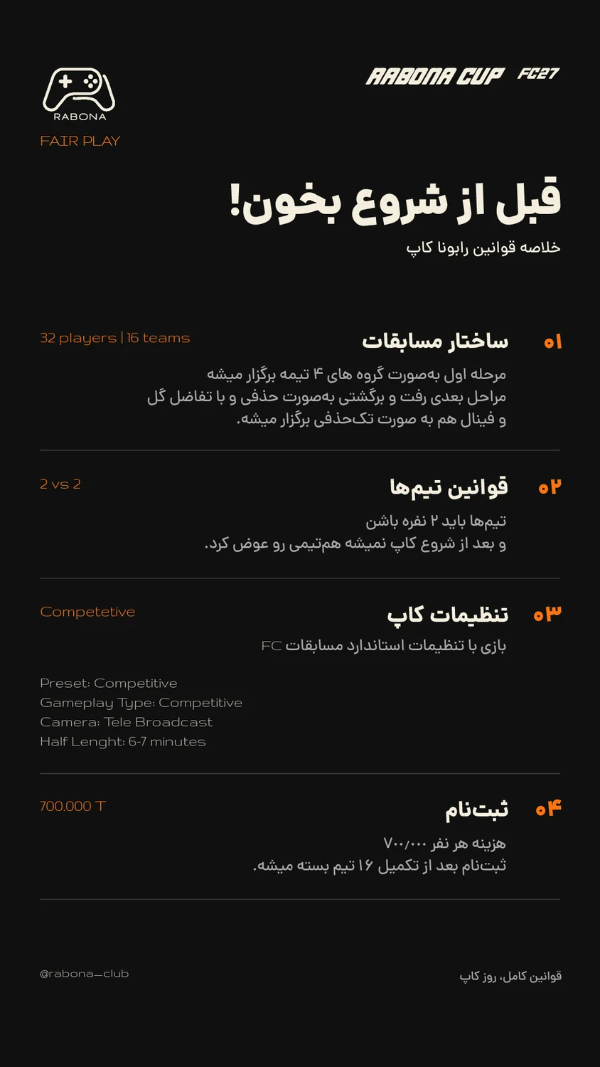
FC 27, on the wall and in the feed.
The tournament poster sets the system — orange diagonal, the players, the prize tiers on the dotted line — and the feed post, story and rules story share its parts.
Credits & status
Clear about the work.
- Existing logo: rebuilt in vector
- Identity system, character, launch and campaign: Danial Hadizadeh